
Laying out your online store raises various questions. Your homepage serves as a hub for the best stuff on your online store, with components such as image sliders, shopping cart buttons, product thumbnails and buttons, and email marketing subscription forms.
Each are essential, but how do you organize them to grab more customers, considering the homepage is generally the most frequented page on your site? If we take a look at some of the most creative, and successful, ecommerce stores, we can figure out a standard layout hierarchy, generating somewhat of a template for where each of these components sits on your homepage.
We’ll start with the top of the homepage and work our way down. Keep reading to learn about the best layout design hierarchy for your homepage to grab more customers.
Your Logo to the Left or Center (And Header Components)
Your homepage header also spans your entire site, so these modules require some deep thought. The goal with your header is to quickly show people what your site is all about and to provide users a few of the most high-functioning buttons and fields for finding content.
The Logo

Start with your logo. A nicely designed logo provides the most value here, but you need to ensure that it’s placed in the upper left hand corner of in the middle of the header. People read from left to right, and the logo typically gives an idea of what the site offers. If your logo doesn’t immediately explain your company, include a short tagline below or to the side of the logo.
The Search Bar

Each ecommerce site is a small search engine inside itself. If one of your customers, let’s call him Steven, lands on your homepage looking for a necklace, he only has a few options to find what he needs.
The first, and less efficient method, involves clicking on one of the menu navigation categories. The second method, which usually takes users to the proper page a little quicker, is a search bar. If the search bar is hidden underneath your slider, or it’s placed somewhere along your sidebar, you force your customers to sift through the clutter just to perform a simple search.
Place this in your header and make it clear.
Shopping Cart Icon and Button
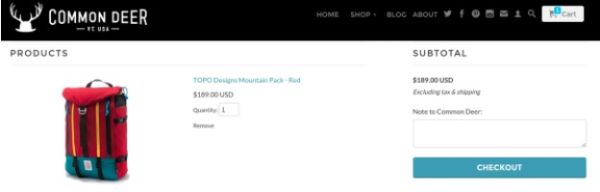
Since so many online stores place the shopping cart icon in the upper right hand corner of the site, you can assume that most customers instinctually look up there to locate what’s in the shopping cart.
Unfortunately, you are typically stuck with whatever your theme or ecommerce platform offers in terms of the shopping cart module, but here’s a guideline if you’re in the market for changing up the design:
- Include a shopping cart icon
- Incorporate a link or icon that provides a one-click checkout from any page on the site
- Show a number to indicate how many items are in the shopping cart
Shipping Announcements
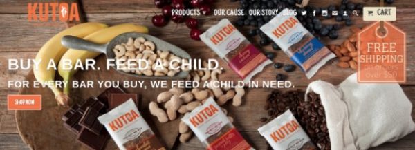
A beautiful way to create urgency is to offer free shipping, or other incentives, after users buy a certain amount of product. If you choose to include something like this in your strategy, it’s essential to make the announcement in your website header.
The screenshot above shows a nice example of how the Kutoa company explains its shipping policy without taking up too much space.
Seasonal Banners
This is similar to the shipping policy we talked about above, but if you are holding a seasonal promotion or a special deal, how do you expect people to learn about this? Reserve a space in your header for small promotional banners. This way, when the holidays roll around you simply drop in a graphic and leave it up until the promotion ends.
Login/Registration Button
This is one of the mainstays on ecommerce homepages. Show a login/registration link clearly in the header. It creates a seamless checkout process for the customer and you can collect some of the customer information.
A Navigation Menu with the Appropriate Tabs
Your menu items depend entirely on what type of business you run, but it’s obviously something that needs to be included in the homepage hierarchy. The best tactic is to write down where you want your customers to move first and choose your menu items based on that. Do you mainly sell shirts? Make one of your first menu items a direct link to your most popular shirts.
Image or Slider with Overlayed Call to Action and Button

The image slider sits right underneath the header, and it serves as a way to share stunning photos of your products. A slider with just images is useless though. Incorporate call-to-actions and buttons that push users to some of your most popular products or promotions.
Include four or five slides in the slider, and change them out depending on your own strategy.
Product Thumbnail Grid or Slider

The Shopify blog explains how offering too many choices confuses customers, pushing them to leave your website or make fewer purchases. Although your homepage requires a product grid right below the image slider, think twice about packing in more than four or five items.
Email Marketing Subscription Form
Collecting emails for sending out future promotions and newsletters is one of the easiest ways to retain customers and keep them in the loop. This is one of the areas where popular ecommerce stores vary in terms of where the newsletter signup sits on the homepage. One conclusion is clear though: If you want people to sign up, you must place a sign up form on the homepage.
The first method is to hit users with the signup form in the header. This assumes that your newsletter provides high-quality content and you don’t feel embarrassed marketing it right off the bat.

Other stores prefer the sidebar or the footer when sharing the newsletter sign up form. I’ve noticed that online stores generally place the forms near the bottom of the page when they don’t send out many emails. They are simply attempting to collect emails to send out the occasional promotion.
My favorite email acquisition tactic is the popup form, which reveals itself after a user in on your site for a few seconds. These typically generate the most subscriptions and you can clearly state that the customer receives something in return.

Sidebars or Grid Based Layouts?
The sidebar provides a unique opportunity to consolidate your less important components, while still giving them the exposure they deserve. A similar method is what we call the grid layout, where your entire homepage involves a somewhat checkered pattern with square modules stacked next to each other.

What are some solid components to include in the sidebar?
- A button or link to your blog
- Promotional or seasonal banners
- Media links
- Social modules or links
- An About us widget or an area explaining what the site is all about

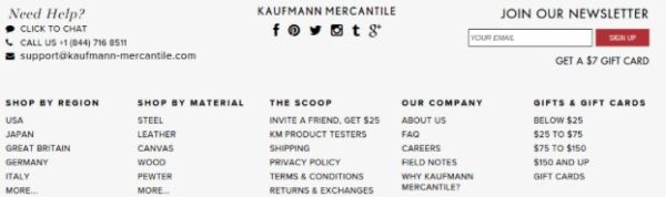
The Footer
The majority of your customers won’t navigate down to the footer, but a few important, yet less urgent links are needed.

I often find that putting together the perfect ecommerce footer is a tedious task because it’s easy to forget a few of the required items. Here’s a list to get you started:
- Contact Us link
- Email Us link
- Phone number
- Order Status link
- FAQ link
- Social buttons
- Warranty link
- Privacy policy link
- Blog link
- Shipping info link
- Return info link
- Corporate info link
- Jobs link
Generating an effective ecommerce homepage hierarchy is an art, but with a little help and understanding of which areas convert the most customers, you can turn your homepage into a hub for activity. That said, leave us a comment below if you think of any other items that belong in this list.
Feature image curtsey of Chris Bannister


Fantastic article with lots of tips to implement. Having the logo to the left with a tagline makes a lot of sense so too does putting the more boring, but necessary links in the footer. Thanks for the list on that.
👍👍👍
Awesome article!
Thanks!
Very helpful informations, they let me make some important improvements on my website
Happy to hear that Jac!
Thank you thank you! You are so amazing about sharing all these tips and how-tos.
Many blessings to you!