
Ecommerce websites are popping up all around us. Are all of them successful? No. Most fail. But why? One of the most common reasons is that they do not put the needs of the user before the ideas of the business.
Good user experience is one of the key features of any successful ecommerce store, and without taking care of this one aspect, you're in an uphill battle to drive sales. And how do you provide great user experience? By perfecting your ecommerce website design.
Below you'll find my favourite examples of ecommerce websites for 2023, compiled from our entire ecommerce website database.
But before that, here are our top rated ecommerce website builders that most of these shops below are using in order to deliver high quality UX and UI:
|
COMPARISON CHART |
Details |  |
||
|---|---|---|---|---|
 |
⭐⭐⭐⭐⭐ |
Free Trial |
 |
 |
 |
⭐⭐⭐⭐⭐ |
Free Trial |
 |
|
 |
⭐⭐⭐⭐ |
Free Trial |
 |
 |
 |
⭐⭐⭐ |
Free Trial |
 |
 |
 |
⭐⭐⭐ |
Free Plan |
 |
|
These websites should give you an idea of what elements you should be focusing on, and some pointers on how you can provide rich user experience through additional website features and good themes.
Ecommerce Design Examples – Table of Contents
- Best Eommerce Website Designs for 2023
- Creating the Perfect Ecommerce Site
- Finding Inspiration for Ecommerce Web Design
- Best Ecommerce Website Builders
- Best Ecommerce Website Designs: Finishing Thoughts
Below each website we have listed one unique key takeaway from each website that you can implement on your store today.
Best Ecommerce Website Designs in 2023: Inspiration
1. The Sill:
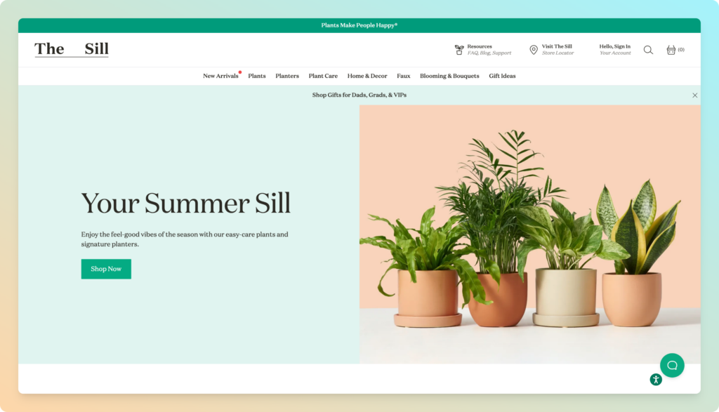
With appealing colors, this website gives off a very clean, simple, and cheerful feeling. The Sill believes that plants make people happy, and so does their online store. The entire site is crisp and refreshing and has a beautiful nature vibe.
The header menu is very clever and it's one of my favourite features on this list. The gap between ‘The' and ‘Sill' is done so to mirror the name of the company. As you scroll down to look at the products the words come together and the other options move to the right.
Key takeaway: Interactive mega menu
Ecommerce website built using: Shopify
2. Couple:

In the bottom right-hand corner of Couple‘s homepage is a chat box. This gives visitors instant access to Couple's support team.
Chat boxes work wonders for improving your customer service and for showing visitors you're dedicated to answering their queries and questions in a timely fashion.
Key takeaway: Consider using a chat box plugin to enhance the quality of your customer service.
Ecommerce website built using: Shopify
3. Rebecca Atwood:
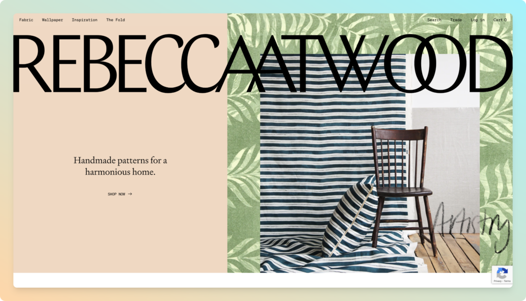
Rebecca Atwood is a Brooklyn-based textile designer with a shiny ecommerce experience. The final product is a bespoke online store that looks as beautiful on mobile as it does on the desktop. The design showcases the products in use which builds an aspirational picture in the users head, as they can see the product in action.
What the website does well is that they offer a click to buy option, similar to what you see on Instagram where you can instantly be transported to the product page.
Key takeaway: Click to buy
Ecommerce website built using: Shopify
4. Mulberry:

Mulberry is a bold company with a striking ecommerce website design. You see big colorful photos and fewer words with this type of website design. If you are looking to design a high-end fashion online store then Mulberry is the perfect place to draw inspiration.
Mulberry's zoom to hover technique on images prompts the user to click the item and also highlights the high-resolution quality of the imagery. If you are familiar with CSS or want to pass this to your web designer here's a simple how-to guide.
Key takeaway: Zoom on hover
Ecommerce website built using: Amplience
5. The New York Times Store:
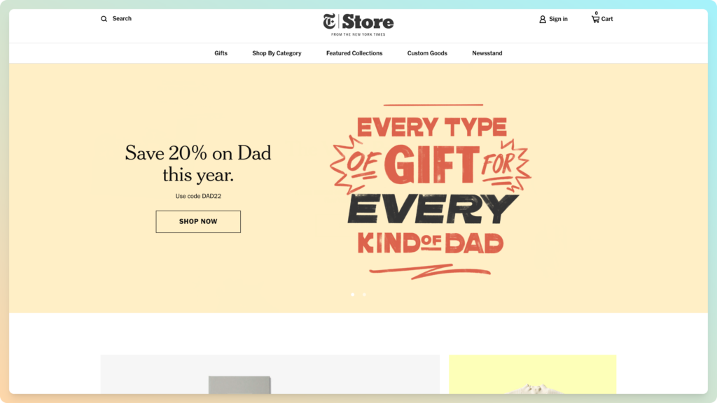
One thing that really makes The New York Times Store website stand out is the organization and typography. The fonts perfectly represent the New York Times brand. The different product options are laid out in a clean grid making browsing and shopping a breeze.
What they also do well is that they bold the typogrpahy for their Best Sellers and Sale items in the header which is subtle, but automatically draws your eye to the products.
Key takeaway: Easily identifiable typography
Ecommerce website built using: Shopify
6. The Owl:

The reason Owl is on the list is their strange take on ecommerce website design. The homepage is not what most online stores look like. That’s a not a bad thing as it makes their web design creative. Creativity helps stores stand out. Doing something a little different can help your bottom line a lot.
Their homepage is very minimalist and they have a video which plays automatically to highlight their products. Again it's very edgy and almost enchanting. Due to their minimalist design, the video won't affect load speeds for users to the website.
Key takeaway: Automatic playing video on your homepage
7. Baron Fig:
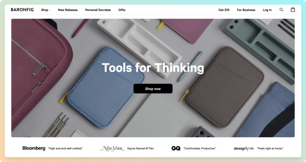
This ecommerce website design is full of great design elements. The first is the minimalistic and sharp photography. The second is the fun graphics and catchy phrases. The color scheme correlates and compliments the product. If you’re looking for a site that uses a variety of elements to create one cohesive feel then Baron Fig is perfect for you.
Slightly below the fold of the homepage, Baron Fig display a rolling display of snippets from press articles from companies such as GQ, Buzzfeed and New York which instantly grab your attention.
Key takeaway: Carousel of comments from the press
Ecommerce website built using: Shopify
8. Beacon:
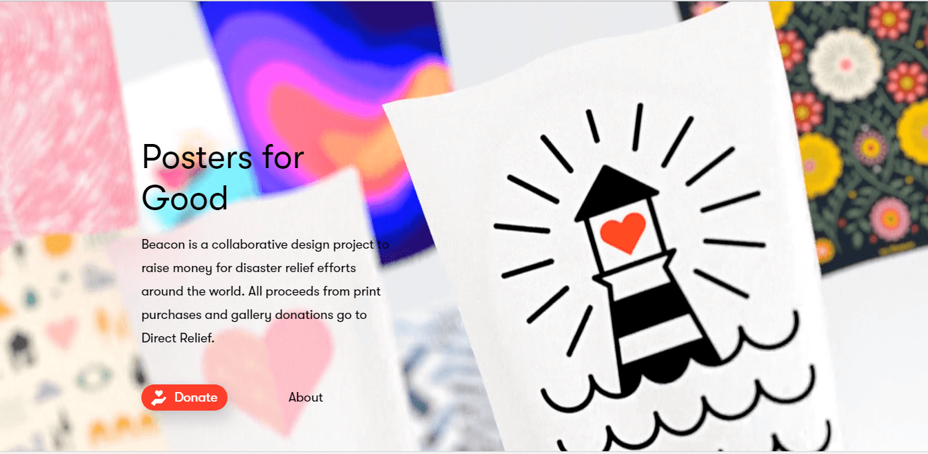
Beacon is a collaborative design project selling posters for good. The website looks like an online art gallery. The products are displayed like actual posters hanging on a wall. The design is simple with very little text and no unnecessary menus.
Via some HTML techniques Beacon also have the background images move which grabs your attention instantly.
Key takeaway: Moving background images
Ecommerce website built using: Shopify
9. Packwire:

Scrolling through the Packwire homepage is an exciting adventure where you don’t know what is going to pop up next. The design features are completely different than any other site. There are fun pop-ups and sliders covering the whole website. Packwire have built a sexy website for a very unsexy business.
Due to their complex design and animations, the page load speeds can be quite long. However, Packwire has used a box unpacking and packing itself to indicate that the page is loading. It's unique to the business and makes the waiting time far less laborious.
Key takeaway: Unique loading icon
10. Caroline Z Hurley:
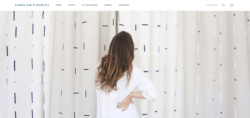
The large stunning photo on the Caroline Z Hurley homepage sets the feeling for how the rest of the website design will be. The fun and simple photography sell the product without even trying. Customers are not bombarded by product options.
The lady in the picture is clearly admiring the product so much that she doesn't even realise the camera is there. It really detaches from the cheesy and standard stock images of somebody smiling at the product.
Key takeaway: Out of the box photography
Ecommerce website built using: Shopify
11. Beatific:

Beatific uses a wide variety of digital content such as photos, animations, and illustrations to successfully convey its message. The color scheme and fonts create a young and playful brand that is evident throughout the entire site.
This young and friendly feel is reinforced with the Facebook Messenger plugin attached to the site. If you are already connected to Facebook you can message somebody instantly for help. You can connect to this website today via the customer chat plugin.
Key takeaway: Connect Facebook Messenger
Ecommerce website built using: Shopify
12. Storm London:

Storm focuses on demonstrating the high quality of their watches. As soon as you are on the homepage of this ecommerce website, you are greeted with descriptions and photos of each watch. The amazing design of this website highlights even the smallest of details to entice the potential buyer.
So much so that Storm don't actually include the footer on their homepage, because let's face it nothing of interest is in there. So as not to draw attention away from the product you can to click a plus sign to extend the footer.
Key takeaway: Expanded Footer
Ecommerce website built using: Shopify
13. Wolf Gang:
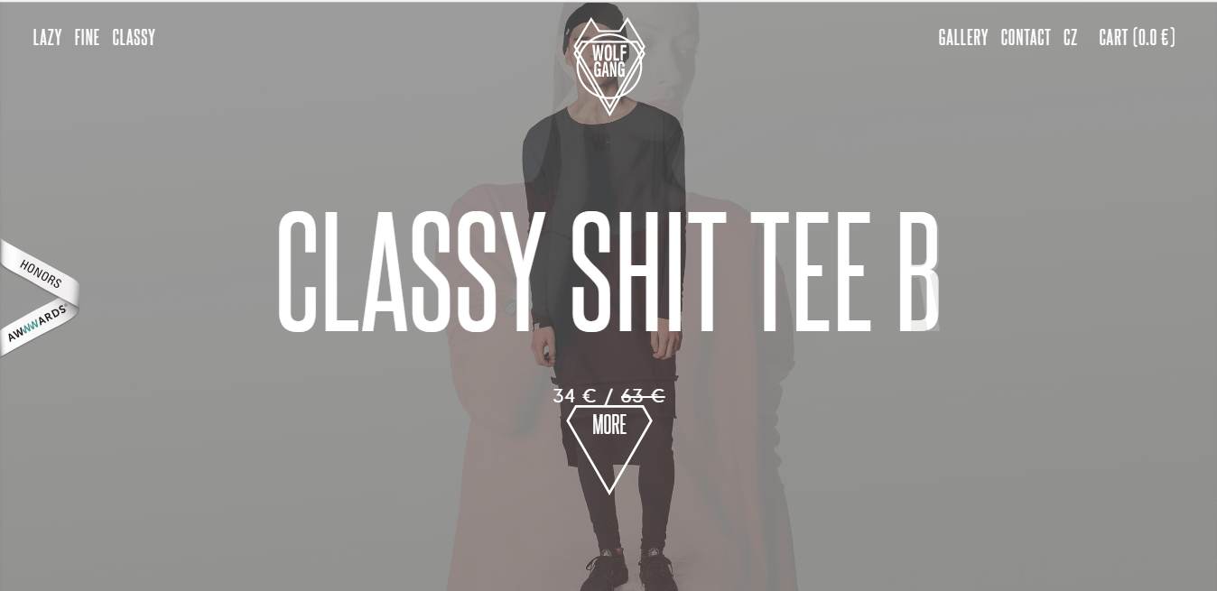
The thing that makes the Wolf Gang website unique is the dark and heavy design. Many sites adopt a more bright design with vibrant colors, but Wolf Gang is the complete opposite. The typography is bold and in your face. The site grabs your attention right away.
What Wolf Gang also do well is that they take the fatigue out of scrolling. With one flick of the ball in your mouse and you auotmatically move to the next section, very clever.
Key takeaway: Section scrolling
14. MSMG:
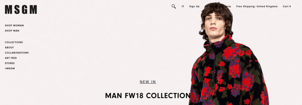
MSMG is the classic example of using vibrant colors and photos.
What struck me most about the MSMG was that the mouse cursor turned to an M. Yes, you maybe thinking at this point that is very 1990's! Yes it is, but people love nostalgia and a throwback. Is it time to embrace that for your website?
Key takeaway: Embracing retro
15. A.N.Other:

A.N. Other uses a sticky button that keeps the company name front and center no matter where you go on the site. The overall design is classy yet unforgettable. It offers a grid-like design which easily draws the eye from one thing to the next.
Their website is split directly down the middle. A.N. Other simply rotate the text and images to keep it interesting, this makes the website so much easier to look at, rather than some website that have no symmetry or order.
Key takeaway: Even sections make for a cleaner design
Ecommerce website built using: WooCommerce
16. Two Chimps Coffee:

The brand's uniqueness shines through as Two Chimps number one priority. The hamburger menu has a rare design and pops up. The entire site is full of distinct features.
When you try to the leave the website you are met with a “Please Don't Go” pop up with a call to action (CTA) that says “Gimme Some”, it's very playful and beats the very unoriginal “add to basket”.
Key takeaway: Clever CTA's
Ecommerce website built using: WooCommerce
17. Not Another Bill:
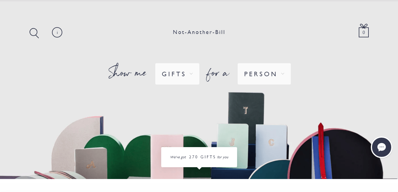
Not Another Bill is a great example of an online store design that stands out in the crowd. Their products are beautiful and clean. The website design makes use of color of the products and white space in the background to show off the artistic products.
They build themselves on being a website that offers unique gifts. This is highlighted by their drop down on the homepage which takes you directly to the product you desire. For example within two clicks you can find ‘Greeting Cards' for ‘Teenagers, this really simplifies the process.
Key takeaway: Simplify how people find your products
18. Sense6:
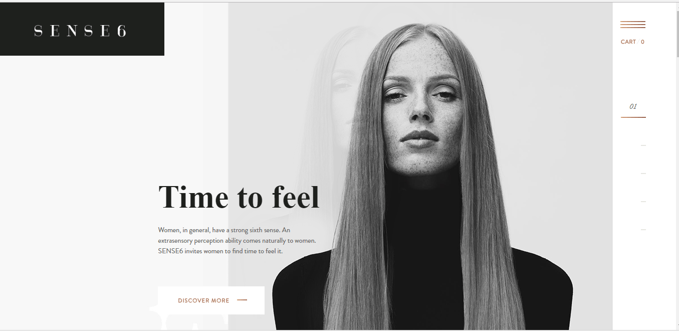
Sense6‘s lack of color makes it stand out from the crowd. The entire site is mainly in black and white. The very few other colors used on the site are intentional and minimal. There are small pops of gold to direct the eye to certain menus and buttons.
Key takeaway: Less is more with colour
19. Manolo Blahnik:

Manolo Blahnik has a career spanning over 40 years, so their website needs to reflect how prestigious they are.
When you scroll down the page, it resembles a catwalk which is very in keeping with their brand. Manolo has created a shadow effect behind their products as well, which is quite unique in this list.
Key takeaway: Use a shadow effect on your images to add impact
20. Native Union:
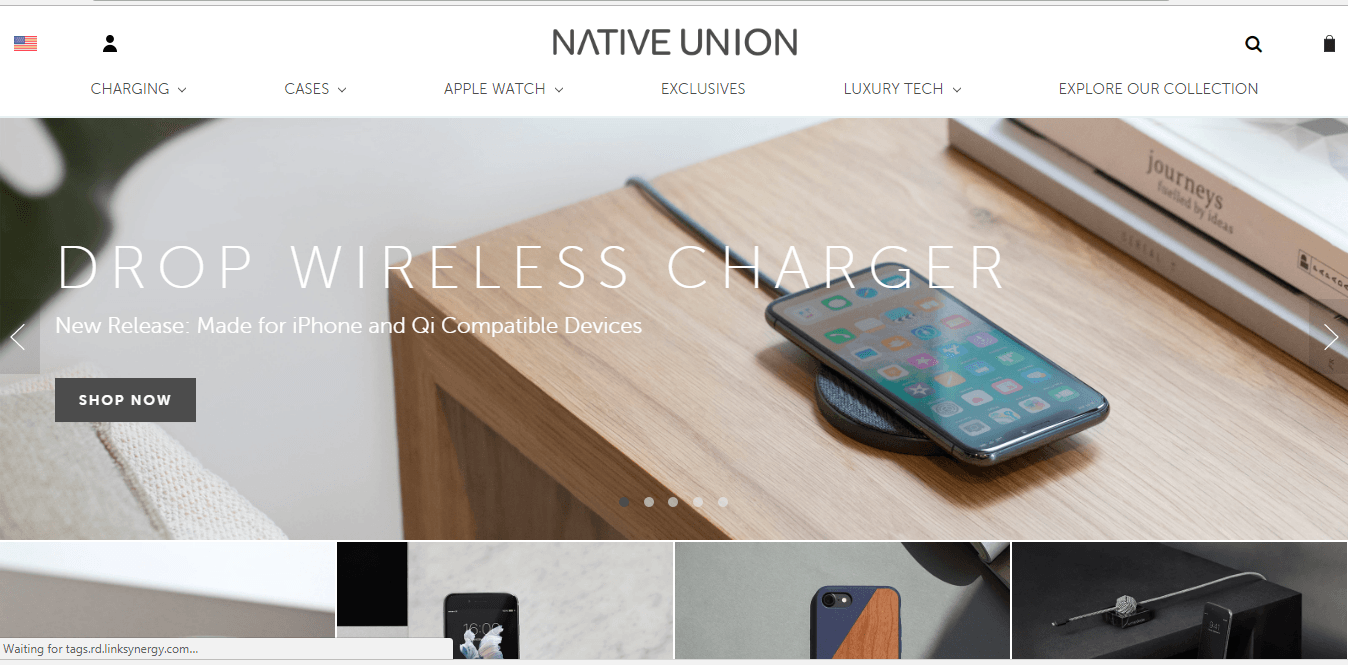
The sliding banner makes the website interactive for the user and easy to navigate to the different pages. The use of images throughout the site is more engaging than text alone and better represents the products. Photos of the products are front and center leaving the user with fewer questions.
When you use the Native Union header menu the sub producuts are highlighted without you having to click them. An additional benefit is that icons are used for users to easily identify what they will be clicking on.
Key takeaway: Use icons to display products
Ecommerce website built using: BigCommerce
21. Really Well Made:

Really Well Made’s website is, well, really well made. If you are looking for a good example of how to incorporate your social media feeds then this site is the perfect example. Really Well Made showcases their Instagram feed right on the homepage. It is an excellent way to build customer confidence.
They also highlight their blog vividly on their homepage. The articles are fantastic and help them to highlight photography that they may not use on their product pages.
Key takeaway: Highlight your blog where you can be less salesy, people will appreciate it.
Ecommerce website built using: Shopify
22. Myro:

Myro's product isn't much to look at, it's essentially a recyclable refill pod, so creating a lifestyle around their product and bringing it to their life in their website design is vital.
To display the simplicity of their product, Myro use an interactive gif below the fold of the homepage which really etices you and highlights the use and effectiveness of the product in a matter of seconds.
Key takeaway: Use interactive gifs to show your product in action
Ecommerce website built using: Shopify
23 Kaffefamiljen:
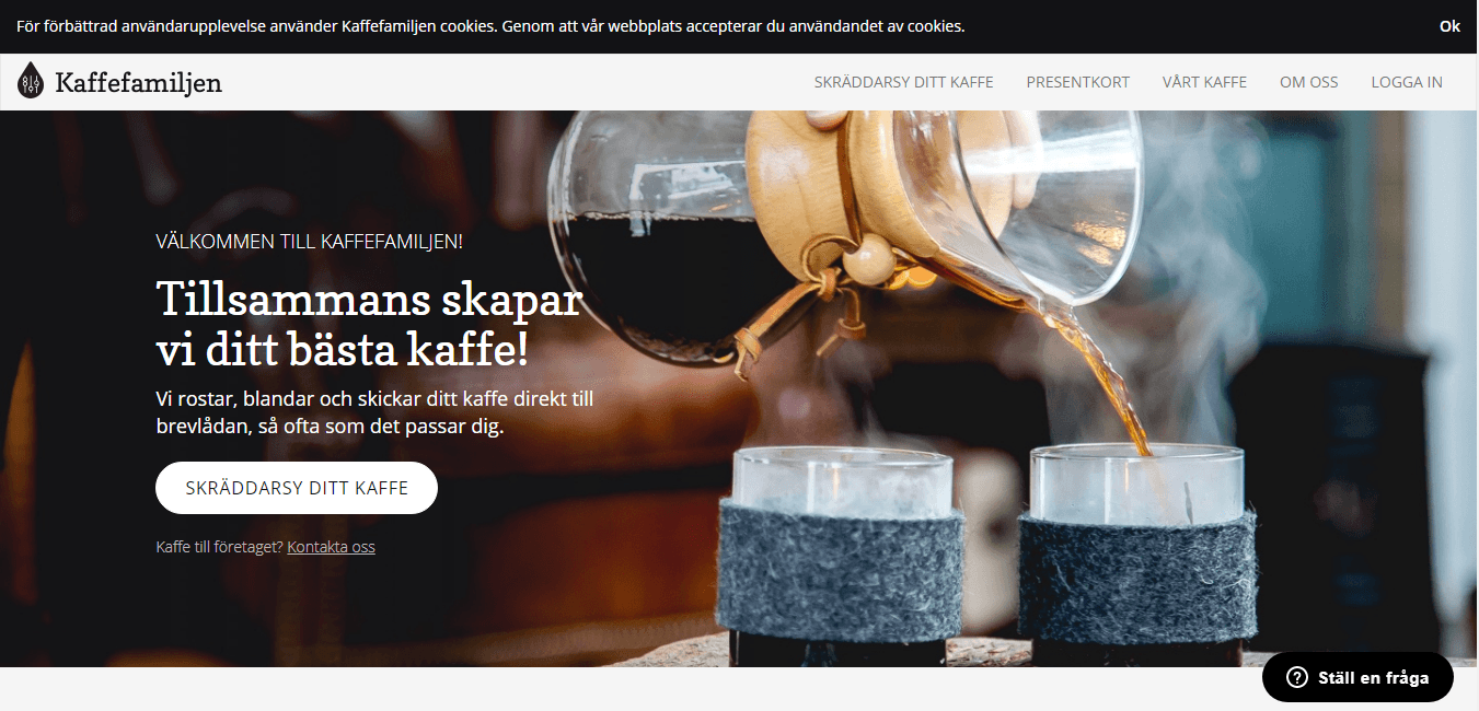
Infographics are a fun, yet effective way to describe a product and business. It breaks it down for the customer and makes it enjoyable to look at. Kaffefamiljen is the perfect example of properly using infographics to draw in the user.
What they also do well is use language such as ‘your coffee', ‘welcome to the family' and ‘what best suits you'. You really feel a part of the brand when a company does this.
Key takeaway: Use inclusive language in your website design
24. Michael Petrov – Emersion:
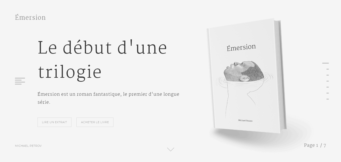
Emersion is a simple yet stunning design. It features seven different scrolling pages. Each page is similar with a small amount of text and an illustration. The very few design elements that are used create major impact.
Although this may not be too relevant on your website but Emersion use pagination in the bottom right-hand corner to inform the user how many pages are left. This ensures that the customer isn't getting frustrated.
Key takeaway: Uses pagination to sort fatigue
Ecommerce website built using: Easy Digital Downloads
25. The Burren Perfumery:

The Burren Perfumery relies heavily on lifestyle shots of their products. There are beautiful photos of their perfume being made and used. The composition of the photos is great. Did you notice their fun font too?
Burren's homepage website design is set up so users automatically buy into their brand. The lifestyle photography teamed with their story is a fantastic tactic in drawing people in.
Key takeaway: Explain your business and get customers to buy in to you
Ecommerce website built using: Shopify
26. Via Copenhagen:
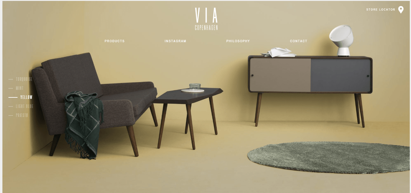
The landing page of Via Copenhagen does not continuously scroll, but instead completely changes pages as you scroll. It is bold and choppy, making each product jump off the screen. The neutral color palette is stunning.
Key takeaway: Replace whole pages with a scroll
27. Save Khaki

Save Khaki's design is very minimalist, with a strong emphasis on imagery which stretches the width of the page.
You may read articles and reports on why it's not the best idea to use a carousel on your homepage. It's been reported that it promotes mixed messaging and it gives the impression that the store don't know what they want to showcase.
However, done right and it can give your website a great aesthetic. Save Khaki don't push different messages they use it to highlight their products in every day use, while the Men's Shop and Women's Shop options stay static so people can decide to shop whenever they choose.
Key takeaway: Use carousels to promote your different products
Ecommerce website built using: Shopify
28. Buffy Comforters:

The background photo makes the user want to jump right on that couch and snuggle under the Buffy comforter. Buffy claims they are the fluffiest, softest, and lightest comforter ever and the website makes it more than believable. It sells the product effortlessly.
Additionally as soon as you begin scrolling, Buffy offers a discount code as a pop-up. This is an obvious technique but is very effective.
Key takeaway: Pop-up with discount offer
Ecommerce website built using: Shopify
29. 450 GSM:

450 GSM does not have a fancy website. It is practical and ideal for the business being presented. 450 GSM goes to show you don’t need to go overboard to have a good looking website. It’s okay to be simple and easy to navigate.
If you find that your industry isn't typically then the most interesting then don't try and make something it isn't.
Key takeaway: Less is more
30. Only/Once:
The layout of the vintage artefacts is great. The different artefacts are aligned in a neat grid making browsing easy. The use of whitespace around each product square makes the site feel clean and organized. The photos convey the charm, character, and story of each piece.
Again this is a great case of how nostalgic products can perform well. People love the past and Only/Once's simple design lets the products do all the talking.
Key takeaway: Bring retro up to date is very popular
31. Aesop:

The ecommerce website design of Aesop focuses on the beauty and naturalness of their skincare line. It’s made up of close up photos of the product and its packaging. This ecommerce website is a good example of how to photograph beauty and skincare products in a sophisticated way.
This is sophistication is backed by how much breathing room they give the products. Most companies focus on a massive logo and giant menu. Let's face it, customers don't care about your logo and they will look for your menu, it shouldn't dominate the page.
Key takeaway: Big menus and logos aren't important
32. MAKR:
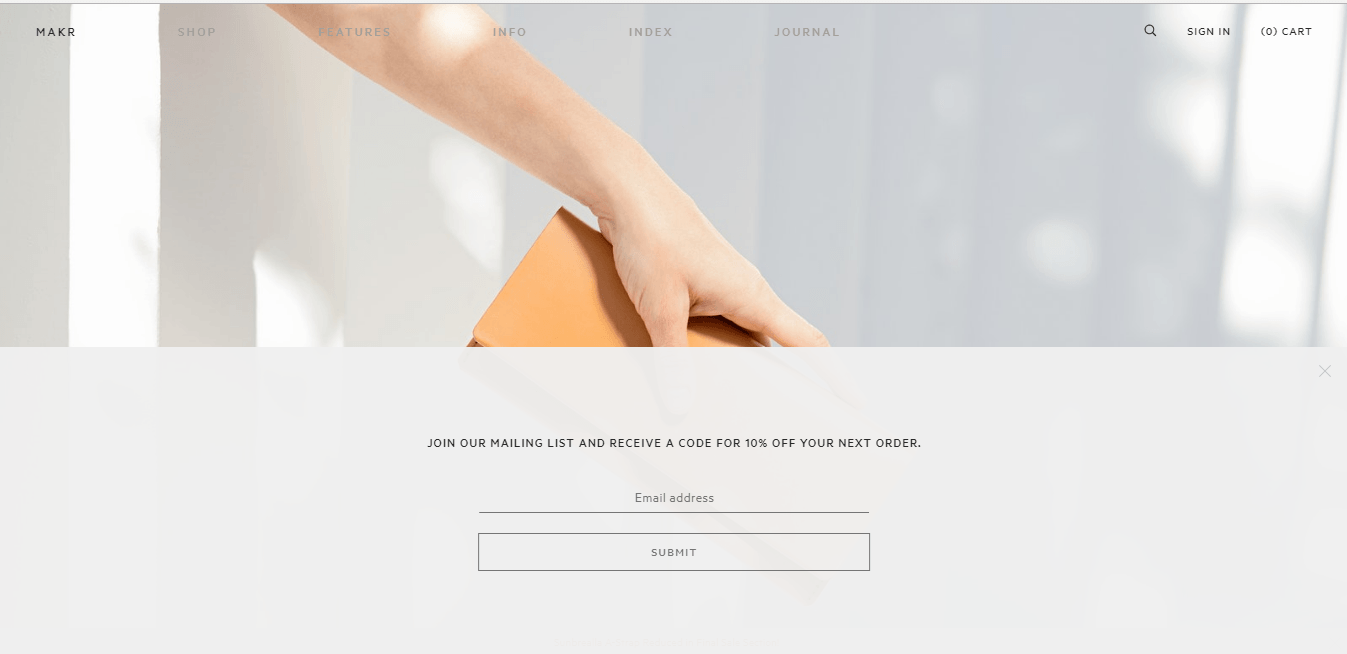
The landing page is specific to MAKR yet interactive to the user. It features rows of different leather products that change color as the user hovers over them. This not only showcases the different products and colors but sparks interest.
Also it shows how different products will look teamed up with different clothing. People may like a product but how will it fit with what they are wearing? It's worth bearing in mind.
Key takeaway: Showcase your accessory items with different clothing
Ecommerce website built using: Magento
33. 42/54:

42/54 uses vibrant colors to their advantage. This ecommerce website does not shy away from flaunting bold background colors. But notice that their overall ecommerce website design is pretty light in general. The bright colors are small accents.
Similar to previous websites mentioned here, 42/54 show that a header menu isn't initally important. The menu only comes in to place when you scroll down, which gives extra emphasis to the Fall/Winter collection they are promoting and increases the click through rate.
Key takeaway: Bring in a main menu after highlighting your products
Ecommerce website built using: Shopify
34. Simply Chocolate:
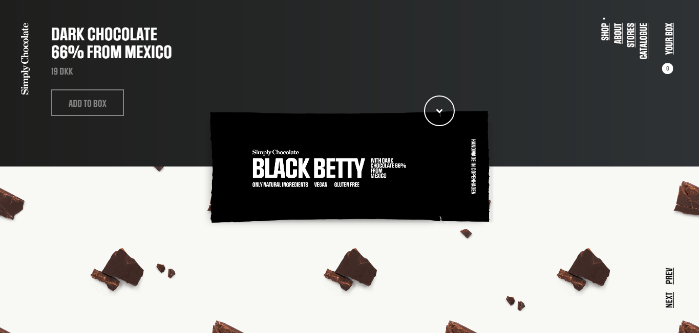
The design of this Denmark based chocolate company ecommerce store gives enough space to let each of their products shine individually. When you scroll down the page, a new chocolate bar floats up in the middle of the page, with each chocolate bar taking an individual color theme, and a fun name.
The website design of this ecommerce store is one that can’t be compared to many others in this list. The menu is actually sideways for a start. What they do well is that the background images help to tell you more about the product. Rather than using words, Simply Chococlate just use images of strawberries and nuts.
Key takeaway: Use your background imagery to describe your products
Ecommerce website built using: WooCommerce
35. Dimension Volumes:
The most notable thing about the Dimension Volumes ecommerce website is the bold typography. The large font grabs your attention and creates dimensions to the entire site. The font is just a little bit thicker than you usually see online. It makes the website design stand out even further.
Key takeaway: Don't be afraid to be BOLD with your text
36. Teenage Engineering:
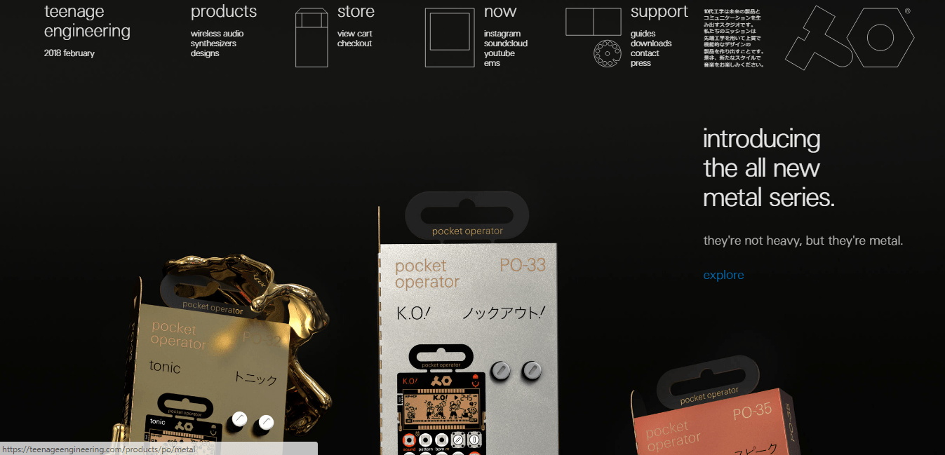
Teenage Engineering has one of the best-designed ecommerce websites in engineering. It looks exactly how you would expect an engineering site to look, but also has a young, modern feel to it. The black background and white font make it stand out.
They also are repeatedly using lower case lettering which is definitely a trend that more businesses are adopting to attract a younger audience, who favour it.
Key takeaway: lower case is in. ok
37. Vipp:
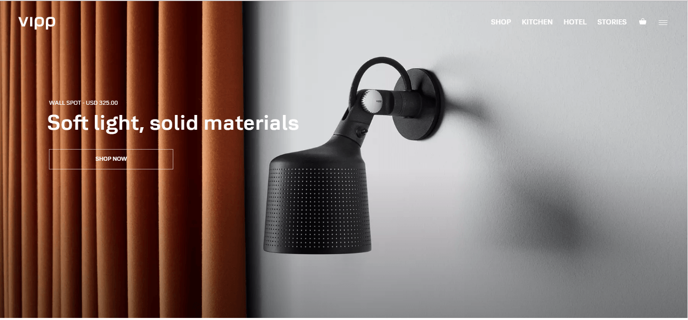
Vipp sells minimalistic household items. Their website follows suit with a minimalistic design. The products are beautifully organized, but not in a boring grid view. This site shows that it’s okay to stick to the basics sprinkled with a few fancy features.
What I like about Vipp is the way hey highlight their prodcut in use after you hover it. Users like the polished studio photography and it being used so give them both options.
Key takeaway: Team your studio photography with lifestyle photography
38. STAUD:
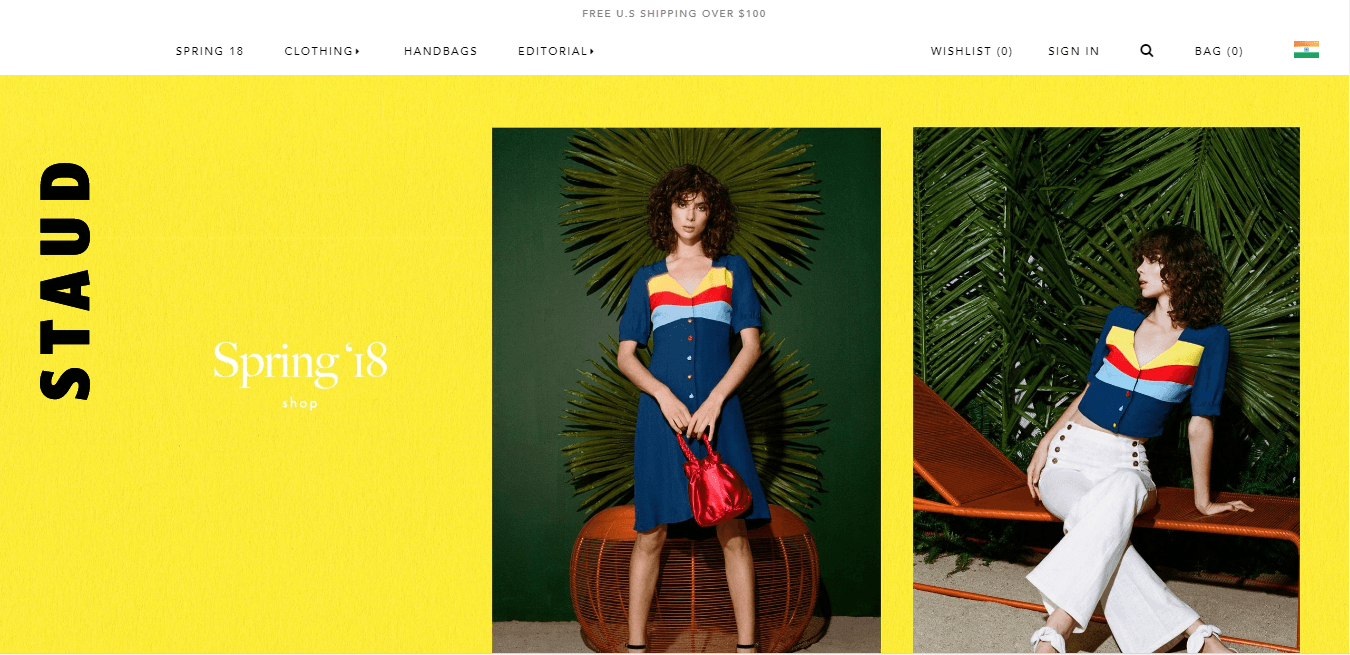
Staud is another example of ecommerce website design that uses bright colors. The colors are used in photos, the product, as well as backgrounds. The text is all in white and black. The balance here is very good.
What STAUD do well is that their pop-up offer stays sticky on their webpage on the right-hand side. Most people can and will click off pop-up offers so keeping it in their vision is important.
Key takeaway: Use a sticky right-hand menu widget to advertise your welcome discount
Ecommerce website built using: Shopify
39. Mallika Favre:
Malika Favre is an in your face website design. It completely eliminates the use of white space and uses bright colorful graphics on the entire screen. This ecommerce website design is both memorable and creative.
Another great usage of interactive imagery, Mallika have the price display when the user hovers over the product.
Key takeaway: Display prices and product names when users hover over
Ecommerce website built using: Big Cartel
40. Verk:

Verk’s home page focuses a lot on the purpose, the engineering, and high standard of the product. They do not jump right into selling their goods. They talk about quality and pride instead of the latest sale or promotion. The entire tactic shows the customer that Verk cares about each and every one of their watches.
Verk advertise their watches as “minimalist”, so it's unsurprising that their website reflects this. They are a company who are very aware of their brand.
Key takeaway: Ensure your website mirrors you brand
Ecommerce website built using: Shopify
41. YIELD:
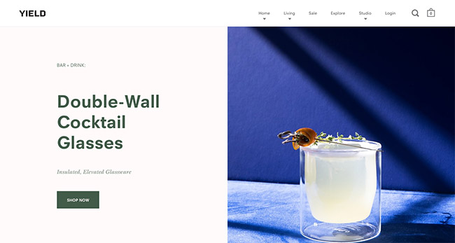
YIELD organized all the product photos into a unique grid design with all the important text right on top of the photos. The homepage is beautiful with very minimal text. All the text and information is nicely hidden away in a hamburger grid on the left.
YIELD's mega menu is great in its design. You can drop down 3 levels to a product but at the same time it doesn't feel overbearing, due to the fact that the menus have been designed differently.
Key takeaway: Don't be afraid to have your mega menu go to a sub-sub-section
Ecommerce website built using: Shopify
42. Charlotte Stone:

This is an example of a women’s footwear ecommerce store with a very soft designer look. The main colors you will see here are light pink, yellow, and white, accompanied by soft patterns. This ecommerce website design goes well with the product that they are aiming to sell. It feels very feminine and fresh, with the font matching the rest of the website’s look.
What Charlotte Stone do well is that they don't force sales on you. They just want to get you to sign up for their newsletter, they do this by changing the colour of the background every few seconds on the sign up form.
Key takeaway: Draw attention to your sign up forms by changing the colour
Ecommerce website built using: Shopify
43. Minna May Designs:
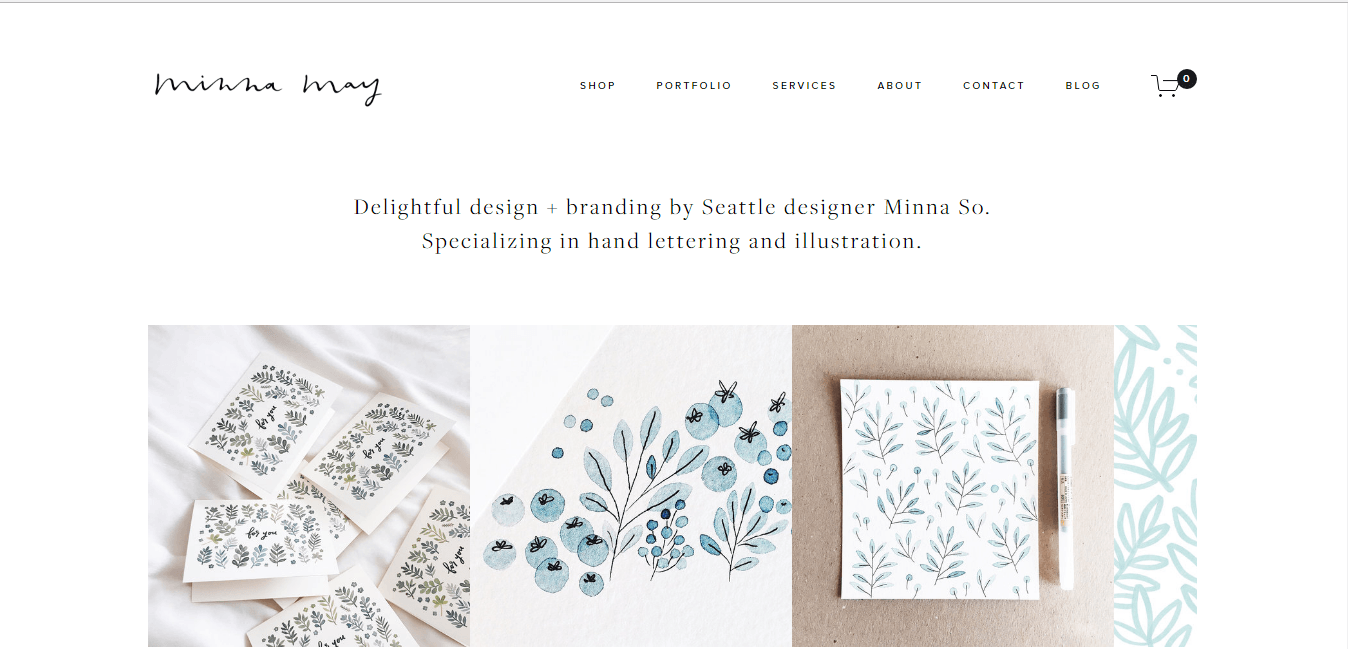
As a business that specializes in hand lettering and illustrations, you would expect to see similar techniques on the Minna May website. The site features gorgeous fonts, light colors, and dainty imagery. The design behind the company comes out in every aspect on the website.
What's different about Minna May to the other shops is that they sell their products on other platforms. However, they use their website for extra design functionality and to highlight their story.
Key takeaway: Use your website as a portal to your Etsy store
Ecommerce website built using: Squarespace
44. Triangl:

Triangl showcases their swimwear in a unique and different way. Instead of the swimsuits being laid out in the typical grid, they are organized by threes on a slider. The price and other information are not focused. The site also uses large amounts of white space to direct the eye.
Key takeaway: White space isn't waster space
Ecommerce website built using: Shopify
45. Bacca:

Bacca sells handmade wooden laptop stands. Their ecommerce website design is full of great design elements. The first is the fun colors and graphics you see at the bottom of their homepage. The second is the quality photos of their stands. Notice that the stands are alone without anything in the background. This helps the product stand out.
Key takeaway: Use plain backgrounds for your images
46. Umbra Shift:

It’s not uncommon for website homepages to go on forever, filled with all kinds of information and photos. Umbra Shift takes the complete opposite approach. It has a very short homepage giving it a less overwhelming feeling. This helps the customer feel more comfortable.
Umbra use space very well and their products dominate their homepage, this ensures that they will look big on any device.
Key takeaway: Use the full width of your website
Ecommerce website built using: BigCommerce
47. Fitzy:
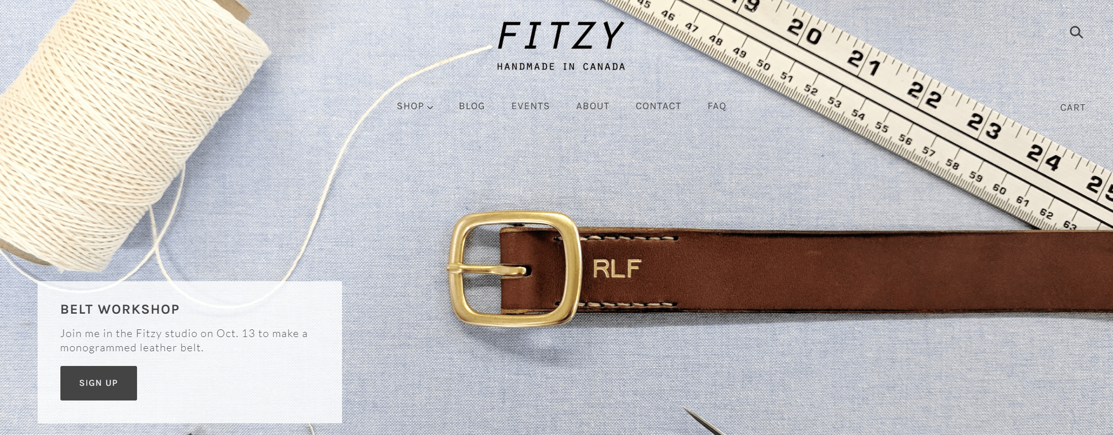
The photography on Fitzy is absolutely superb.
A quick scan of their website and you can see passport wallets displayed at breakfast tables, a cherry blossom style bag amongst cherry blossom trees and belts surrounded by the materials that made them.
Handmade products and the boom of etsy are massive in the ecommerce world. What Fitzy do well is they display this as their tagline and reinforce this throughout with their close-up photography.
Key takeaway: Sell handmade products? Give authenticity by displaying how you made them
Ecommerce website built using: Shopify
48. Read Only Memory:
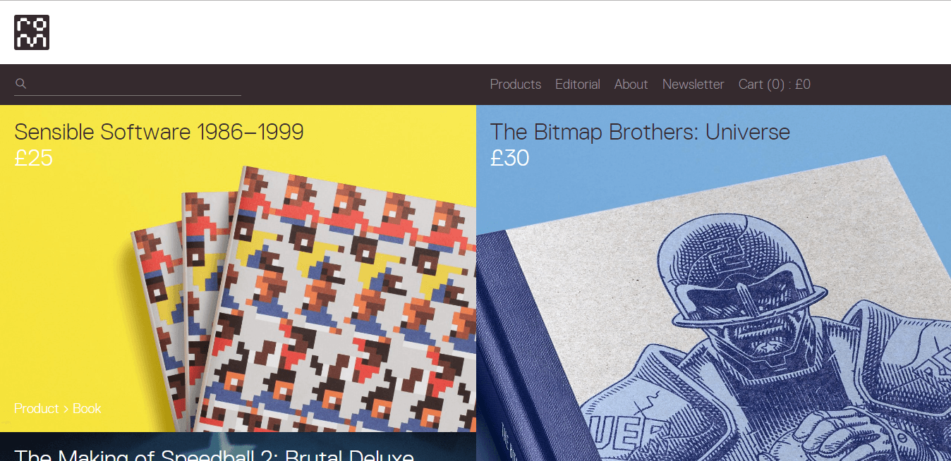
Read-Only Memory published books about video games, so it only makes sense to have a website with a video game-like design. Similar to the company, the site is the perfect mix of video game and book designs. It features a big block grid-like system to organize the products.
Another good use of a sticky menu here, this time on the product pages where the add-to-cart and checkout options follow you as soon as you click a product
Key takeaway: Use sticky menus on your product page to help your conversions
Ecommerce website built using: WooCommerce
49. Good Moods:
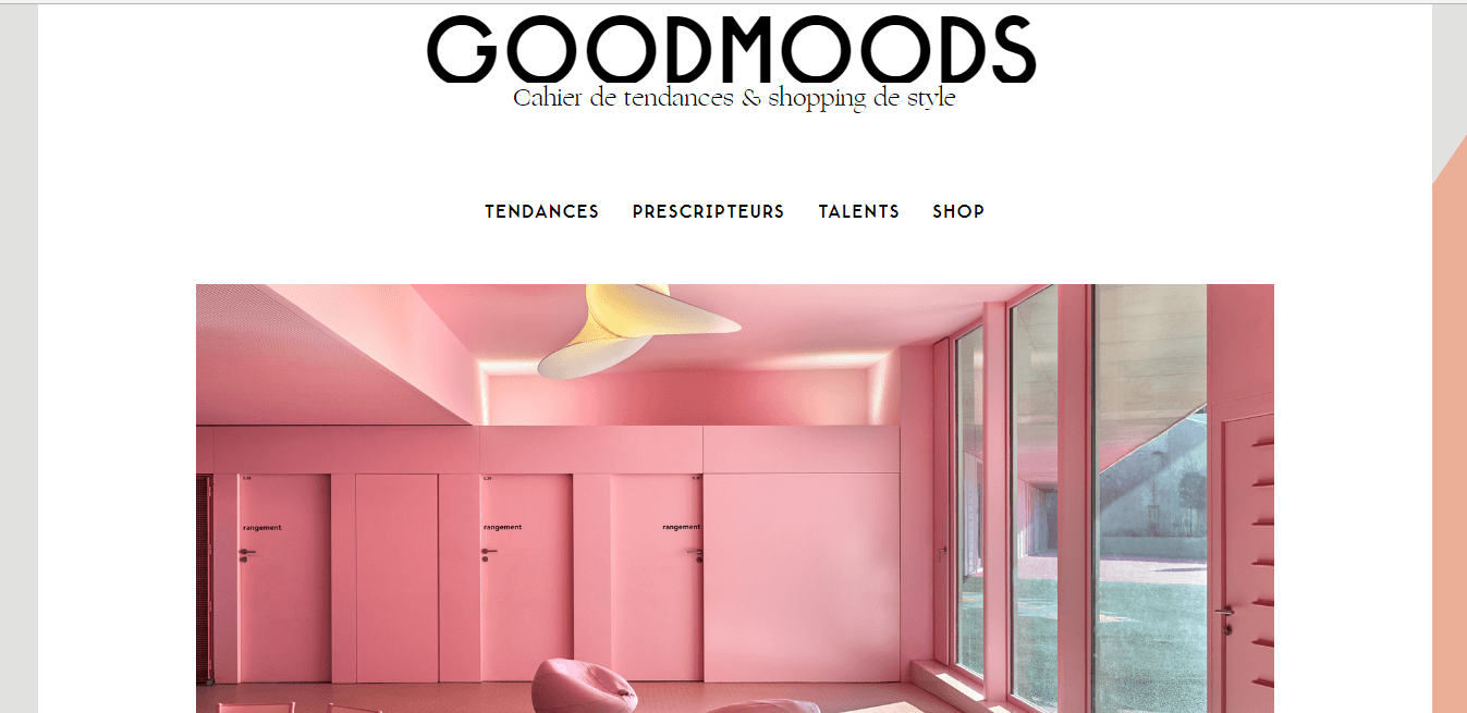
Good Moods is one of the most aesthetically pleasing websites. It is a perfect mixture of bold and bright, yet soft and tender. It features beautiful lifestyle photography. The color palette has a calming nature about it.
Good Moods have over 15k followers on Instagram and by looking at their website you can see they are big on photography. So if you have it flaunt it, integrate your social media platforms into your ecommerce website design
Key takeaway: Highlight your Instagram if you are big on photography
50. Aida Eats:

There are so many glowing things to say about this site; however, I'll keep it brief. The tagline here is simple, bright, and oh so punchy. It tells customers straight away they're in the right place;
‘Eat well. Entertain Easily'.
So, from the get-go consumers know what Aida Eats is all about.
We also love the imagery on the homepage. They showcase some of their favorite products by having open packets with different snacks spilling out of them.
This is incredibly clever.
Not only does it look impressive, but it also shows the customer the goods Aida Eats has to offer. The customer's exposed to their products without even having to search for anything- it's genius!
Key takeaway: Give your tagline some thought. Draft something your customers will relate to, and hopefully remember. It should highlight what your brand stands for in just a few words.
Ecommerce website built using: Shopify
51. Molekule:

Molekul makes the most of their huge video banner on their homepage. It shows their core product in action in addition to giving visitors a glimpse into the science behind their air purifiers. This works wonders for building trust and credibility with their audience.
We also love that as you scroll down, the first thing you see is proof of their excellence. They've listed the awards they've won for their products alongside a small logo representing the award. For example- Best New Product in 2017 from the Edison Awards.
Key takeaway: Publish social proof on your homepage to boost credibility.
52. Kaptain:
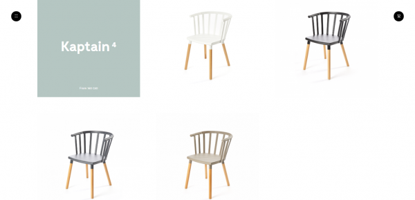
If you're only selling a few select products, take a leaf out of Kaptain's book. On their homepage, they keep things incredibly simple by allowing their products to speak for themselves. All they have is a few clickable pictures on a white background.
After all, you know what they say- ‘a picture speaks a thousand words.'
Key takeaway: Declutter your homepage. Remember, less is usually more.
53. Boon Supply:
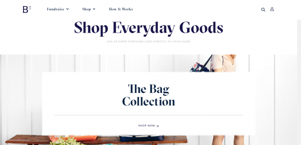
Most people want to donate money to charity. So, Boon Supply knocks it out the park by enabling customers to give 40% of the total cost of their purchase, to the charity of their choice.
This USP is highlighted in their tagline, so people know straight away what makes Boon Supply different from its competitors.
Key takeaway: Include your USP in your tagline.
Ecommerce website built using: Shopify
54. Austin Eastciders:

The copy on Austin Eastciders‘ homepage is pretty impressive. Once you scroll past their impressive video banner, you reach a slideshow highlighting their favorite products.
They certainly know how to position their products to entice their target demographic. They use words like; ‘dry champagne,' ‘only contains 3g of sugar', ‘sticking with your resolutions'- you see what they do here…they identify the needs of their customer and explain how their product fulfills that need.
Key takeaway: Get to know your audience and ensure it's reflected in your copy.
Ecommerce website built using: Shopify
55. Package Free Shop:

One of the best things about the Package Free Shop is its plastic-free packaging. This is one of their USP's, and they make this well known in both their header (where they also offer free shipping for orders totally $25 or more) and further down their homepage.
Key takeaway: If you're able to offer free shipping, do so- customers love this! A boost in conversions is almost inevitable.
Ecommerce website built using: Shopify
56. The Goodwell Company:

Usually, I'm not a fan of pop-up opt-in forms, because, on the whole, they annoy visitors. However, the Goodwell Company offers a fabulous one!
Visitors can spin the wheel for a chance to win a discount when they provide their name and email address. This is a fun way of delivering value to your customers.
Key takeaway: Find and use a unique style of opt-in form. You're far more likely to get customers to engage with this.
Ecommerce website built using: Shopify
57. Blume:
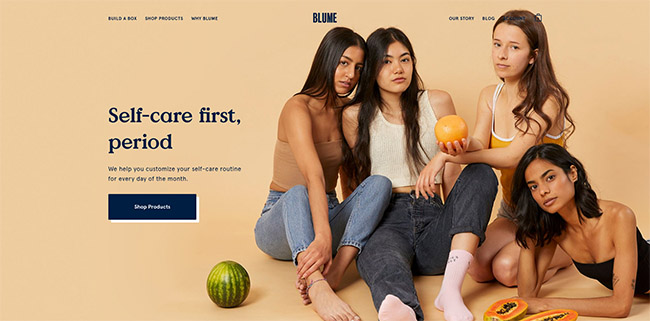
As you scroll through Blume‘s homepage, you'll see they breakdown exactly how to use and order a subscription box- making it super simple for customers to understand the process.
In Blume's case, all you need to do is choose what you want, pick how often you wish to receive one of your personalized boxes, then cancel it anytime you want- how straightforward is that?!
Key takeaway: Keep your copy simple to reach out to customers who aren't familiar with your brand.
Ecommerce website built using: Shopify
58. Recess
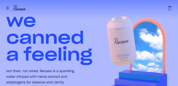
I love their motto, and man do they make it known. The words' ‘we canned a feeling' are plastered all over the top of their homepage.
Then next to the motto, is a can floating beside moving clouds, which sort of gives off a heavenly vibe.
This makes sense. People want to feel good. It really is as simple as that- and Recess has capitalized on this with their web design and copywriting.
Key takeaway: Think about what your customers want to feel, and appeal to that via your web design.
59. Get Room:
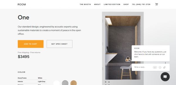
If your brand has one signature product, do what Get Room does and make it the first thing you feature on your homepage. They use high-quality product photos to give the shopper a better idea of what to expect when they spend their hard earned cash with them.
Not only do they use short, snappy copy to describe their key product, but they also highlight their call to action button by making it way brighter than the other elements on the page.
60. PowerOnPowerOff:
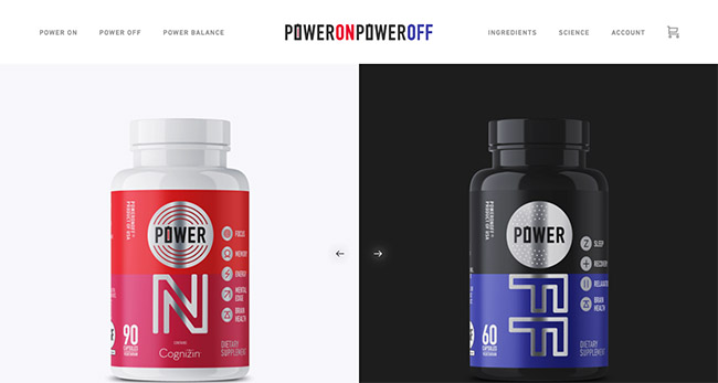
PowerOnPowerOff’s homepage focuses on the why and benefits of the product instead of jumping right into the latest sale or promotion. What's interesting with PowerOnPowerOff website is that they they use long scrolling. This technique is used to not fatigue the user when scrolling through their home page. New information is populated and looks interactive when the user moves down the page resulting in a beautiful ecommerce website design.
Key takeaway: Long scrolling can reduce user fatigue
Ecommerce website built using: Shopify
61. Port of Mokha:

On Port of Mokha‘s homepage, they give customers two options. They can either subscribe for a monthly package or shop for individual products.
This brand makes these choices clear from the get-go, so consumers know their options before browsing the rest of the site. Having a store that's easy-to-use is imperative for improving your conversion rates.
Key takeaway: Make your site easy to navigate.
Ecommerce website built using: Shopify
Further reading 📚
Creating the Perfect Ecommerce Site
While there are a lot of important lessons to take away from the list of ecommerce websites mentioned above, it’s important to remember that all sites are different. While you should definitely strive to make your online environment as user-friendly and appealing as possible, you’ll also need to think carefully about a number of other things.
For instance, all websites should have ease of use baked into their core, as well as strong product descriptions, unique checkout pages, and simple solutions to help your customers spend their money with ease.
However, it’s the little details that you add to your online business that really helps it to stand out.
For instance, think about:
- The audience that you’re trying to attract: Different kinds of customers expect different things from a website. Some younger audiences will expect more animations and graphics, while B2B customers expect a lot of reliable information.
- The budget that you have to work with: Small businesses are generally limited on cash. While tools like WordPress allow you to start building your website for free, you’ll still need to pay for some crucial investments yourself.
- What your business model is going to look like: Some small businesses sell products through their own distinct checkout pages. Others integrate their ecommerce web design with tools like Amazon or dropshipping services. Knowing how you’re going to sell to customers will affect your ecommerce design significantly.
- How you’re going to advertise your site: Remember, people won’t just come and find you on their own. You’ll need to think about how you can attract customers through Google with search engine optimization, you may want to try things like email marketing with your SEO too.
- How you’re going to display your products: Are you going to stick solely with product images, or do you want to offer your customers slideshows and videos that can help them to dive into your product’s potential? Adding new features is great, but you’ll need to ensure you don’t slow down your website.
- How you’re going to stand out: No matter what products you might be selling, from custom t-shirts to mobile devices, you can bet that there’s someone out there with the same product categories as you. That makes it crucial for you to find a way to separate yourself from your competition.
- How can you deliver the best customer experience? Customers today are looking for sensational experiences more than anything else. Update your store design to focus on ease of use. That includes providing a responsive design that works on any smartphone, and a smooth checkout process with plenty of payment options.
Sometimes, developing a thorough business plan will help you to drive your ecommerce web design strategy in the right direction. The more you know about your company, your customers, and even your competition, the easier it will be to ensure that you don’t lose out on valuable sales.
You might even decide that you’re going to try a new kind of business plan entirely. For instance, many new companies are beginning to experiment with dropshipping as a simple way to fulfill their orders without having to invest in warehousing strategies.
Finding Inspiration for Ecommerce Web Design
Although the examples above can’t show you exactly how to design the ultimate ecommerce website, they can provide you with some useful information on what it takes to make a site successful. It’s up to you to figure out who your customers are and what they need from your website. But you can use the previous sites as inspiration to get you moving in the right direction.
There are piles of amazing websites all around the internet in your niche and others that can show you how amazing ecommerce websites can be, if you know how to make them properly.
Looking at today’s most attractive ecommerce sites, you can see that it’s not just stunning web pages that drive your company forward, but everything from search engine optimization, to the ability to take multiple kinds of credit card payments.
When you’re developing your own ecommerce business site, the best thing you can do is look at the sites that already exist, and find ways to make your own solution even better. Think about what your competition is doing, and ask yourself what you can do to set yourself apart from the crowd. That might mean adding more features to your shopping cart, like payment gateways (PayPal, Shopify Payments or Stripe), shipping rates or gift cards.
On the other hand, you might decide that you want to create a custom boutique area for online shopping, where customers can add their own names and other details to products using a print on demand service.
The average ecommerce website builder today comes with a host of fantastic ways to make a positive first impression on your audience, and keep them coming back for more. Going beyond high-quality product descriptions and photos to show your audience what makes your online business special is a great way to ensure more sales in the long term.
Just remember that you’ll need the right tools to get you started, Magneto, Squarespace, WordPress, Volusion and other leading ecommerce website builders can only accomplish so much on their own. You may also need to explore plugins and add-ons to bring extra functionality into your site, or even think about working with a specialist.
Best Ecommerce Website Builders
If you want to create a stunning ecommerce website, like the ones that we’re showing here, then you’re going to need the right tools. The best websites come from the top eCommerce site building solutions. The good news for today’s business owners is that there are plenty of options to choose from.
Because all business owners (and businesses) are different, ecommerce website builders come in a lot of different flavors. Some allow you to build your website almost completely from scratch, with access to coding.
Others make it easier to unlock the full potential of your website with themes and templates.
Many of these ecommerce website builders come with web hosting and other excellent features to explore. Here are of the best ecommerce platforms to explore.
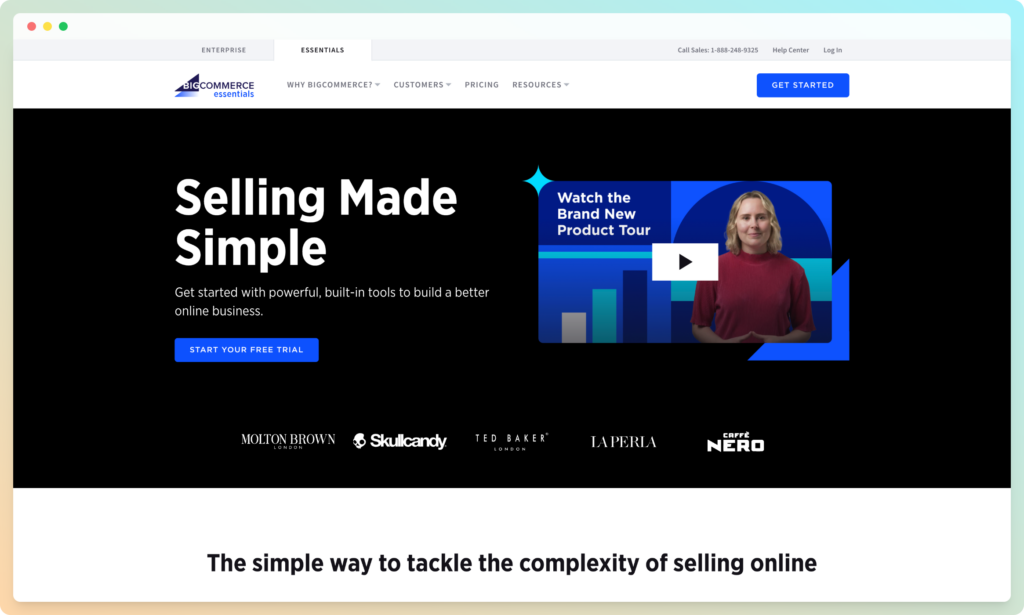
Shopify

Shopify is one of the market leaders in ecommerce site design. It’s a leader in the market thanks to its impressive out-of-the-box experience for anyone and everyone looking for a quick way to launch an impressive online shop. Shopify has an easy-to-use backend, a super intuitive set of features, a drag-and-drop-builder, and plenty of guidance for customers too.
With Shopify, you have the freedom to list any kind of product for sale, whether it’s a service, a digital download, or a physical item. You can manage your site inventory on the back-end, collect payments from your customers using the tools they prefer, and more. If you don’t find everything you need already built into Shopify, then you can always get some add-ons and plugins to fill the gap.
The Shopify App Store is part of what makes it one of the best ecommerce platform options in the world.
Pricing 💰
Using Shopify to build your eCommerce website can be as cheap or expensive as you choose. There’s a 14-day free trial available to get you started, followed by a $29 per month cost for basic Shopify. If you want something more advanced, you’ll spend around $299 for Shopify Advanced, or just $79 per month for the standard Shopify experience. Those who want a simple button for their eCommerce store can try Shopify Lite for $9 per month. If you need to support a complex ecommerce business, Shopify Plus is available on a quote-only basis.
Pros 👍
- Free trial so you can test the service before you commit
- Large range of themes and design options to choose from
- Fantastic selection of pricing options for different companies
- Great integrated payment options
- Unlimited product access on all plans
- Massive marketplace for add-ons and plugins
Cons 👎
- Not the best for blogging
- Can get pricey depending on how much functionality you need.
👉 Read our Shopify review.
BigCommerce
BigCommerce, like Shopify, is one of the top performers in the industry for companies looking to build a complete shopping experience. The site builder associated with BigCommerce is easily one of the most impressive tools that it has to offer. With this builder, you can access some detailed customization options to make your website stand out.
BigCommerce makes it super easy to list your products, set up a category page, or multiple, and deal with things like shipping details. On top of this, the eCommerce service provides fantastic customer support for its users. However, BigCommerce isn’t always ideal for beginners.
The system is pretty advanced compared to some of the other shop builders out there. That’s great for developers who know their way around code, but it might not be the right tool for people just getting started. BigCommerce does have a great community around it, however. This could mean that you can simplify the process of building your store just by reaching out to someone who has a little extra coding knowledge.
Pricing 💰
The cheapest plans for BigCommerce start at a monthly fee of $29.95. There’s a 15-day free trial so you can test the services for your eCommerce website design. If you need more functionality than you get from the standard package, BigCommerce Plus is $79.95 per month. Alternatively, you can upgrade to the Pro plan for $299.95, or speak to the BigCommerce team about an Enterprise quote.
Pros 👍
- Excellent visual merchandising tools – great for beginners
- Unlimited product listing options, bandwidth and storage
- No transaction fees necessary
- Lots of product rating and review options
- Large range of free applications to improve functionality
- Sales supported across multiple channels
Cons 👎
- Bit of a learning curve to sort everything from your homepage to checkout
- Not the best selection of themes
👉 Read our BigCommerce review.
Squarespace

Compared to Shopify and BigCommerce, Squarespace isn’t quite as much of a big deal – at least not yet. However, it still stands out as one of the leading site-building tools on the market. This fantastic tool is particularly good for store owners who want beautiful and creative template designs.
If you’re new to the world of website building, Squarespace makes it easy to start loading your inventory up online. There are tons of features to explore within the platform, including email marketing and social media integrations. There aren’t any plugin apps to help you extend the functionality of your store, but beginners won’t need many extra features.
Squarespace is best suited to creative people who want to showcase their artistry online. It’s ideal for creating professional website portfolios as well as stores. This is definitely a product worth trying if you want a simple interface and plenty of attractive store designs.
Pricing 💰
Like Shopify, Squarespace gives you a free trial for fourteen days before you need to pay for a premium package. The initial pricing package starts at $12 per month, but you can upgrade to a more advanced option that costs $36. There’s no free plan, but Squarespace is still very affordable.
Pros 👍
- Fantastic integrations with social media
- Lots of templates to choose from with plenty of white space and visual appeal
- Budget-friendly pricing options
- Support is wonderful for beginners
- Annual plans come with a free domain
- 14-day free trial
Cons 👎
- Transaction fees can quickly add up
- Not as many payment options for your product page
- No app market for things like SEO plugins
👉 Read our Squarespace review.
Square Online
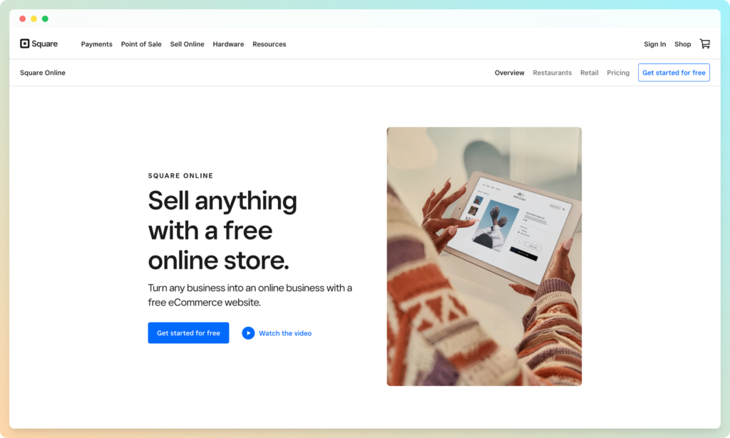
Square Online is a unique solution for people in search of the best website builders. This tool is free to use- which makes it a leading option for beginners. It also integrates perfectly with the existing Square solution for POS technology. That means that you can easily combine your online and offline presence if you need to.
Square comes with things like a free URL to get you started, free hosting, and all the responsive web design tools that you need. You can track and manage your inventory on the back end, with automatic syncing built-in. Plus, you can access things like pickup services and deliveries too. There’s also plenty of themes and templates to assist you in making your store stand out from the crowd.
Square Online is likely to be the best choice for companies that want to develop an online solution to showcase their store to the digital world. If you already have a retail location or restaurant, and you want to take it to the next level, Square can definitely help with that. You might need to learn a little coding if you want to get really advanced with your customization, however.
Pricing 💰
Square’s pricing can be a little complicated to follow when you haven’t used the service before. The point of sale solutions from Square all have their own expenses to consider, and you’ll need to pay for your transactions too. However, it’s free to start building a website with the Square system if you're already using the Square ecosystem.
Pros 👍
- Ideal for people who sell online and offline
- Great if you’re comfortable using Square for transactions
- Fantastic range of tools for inventory management
- Easy for beginners to access
- Good for those who want to experiment with AI
- Free hosting
Cons 👎
- Limited access to small business customization options
- Not as many payment options to choose from
👉 Read our Square Online review.
Wix

Finally, if you’re on the hunt for an easy-to-use website building tool, and the options above don’t appeal to you, then Wix could be the ultimate choice. As one of the most popular software options in the world, Wix gives business owners access to everything they need to launch their own amazing online presence. You can even choose your own domain name.
Wix stands out because it has an intuitive backend interface, plenty of built-in ecommerce features, and lots of ways to enhance and style your store. You can add features to your website however you like with an easy-to-use builder, and there are hundreds of templates – far more than most of the other competitors similar to Wix on the market today.
If you’re particularly low on cash and you want to test out the functionality of your site builder before you commit to anything, Wix also comes with a free version. Just keep in mind that the free option won’t suit you for long. Wix displays ads on your website with it’s free package, which makes it much harder for you to convey a professional image for your business.
Pricing 💰
Wix is one of the few website building tools available today that offers a free-forever option. You don’t need to pay anything for your site unless you want to upgrade to more features. This could make it a great alternative to WordPress for some people. If you decide to upgrade to premium, then you’ll have access to your own domain, and you can remove all Wix ads from your eCommerce design. Pricing starts at $8.50 per month.
Pros 👍
- Great collection of some of the best ecommerce website designs
- Multiple credit card and payment options for customers
- Plugins and apps available to extend site functionality
- Great for those who want to start out on a budget
- Discount and coupon options
- Tools to help you stand out on Google
Cons 👎
- Not the most advanced for eCommerce features
- Difficult to customize due to lack of open source access
👉 Read our Wix Ecommerce review.
Weebly
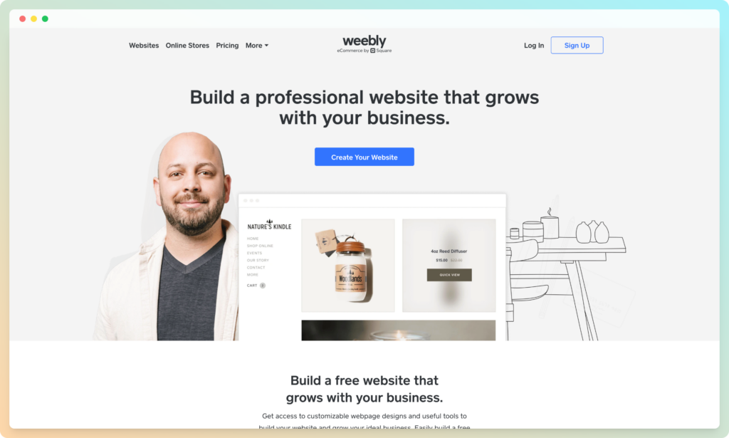
Weebly is one of the smaller website building tools on the market today. Designed to support smaller business owners who want to go beyond selling on Amazon, Etsy, and eBay, Weebly makes it easy to sell products and services online.
Although you don’t get as much scale, or all the advanced features common among other website builders with Weebly, you do get a good entry-level solution that’s great for beginners. The Weebly website builder will give you the tools you need to build an effective website without spending a fortune. What’s more, you won’t need a lot of extra time or tech knowledge to get started.
Unfortunately, there aren’t a lot of customization options available with Weebly, so if you want to adjust things like your checkout page or your product pages, you might struggle. However, you will be able to unlock things like password-protected pages for memberships and blogging tools so that you can begin to build a more active presence online.
If you’re a company that’s not planning on selling a huge number of products, and you want to create a professional image for yourself online, Weebly has you covered. There are a lot of great professional themes to get you started, plus, you get transaction support from Square.
Pricing 💰
Weebly is a fantastic service for companies on a budget, with a price starting at $0 if you only want basic functionality. The Personal plan is $9per month, or $6 if you pay on an annual basis. Professional plans are $16 per month, or $12 when billed annually, and the Performance plan is $29 per month, or $26 when billed annually.
Pros 👍
- Easy to use for beginners with no tech knowledge required
- Lots of beautiful themes and design options to make you stand out
- Integrated apps improve the functionality of your site
- Affordable pricing packages, including a free forever option
- Blogging functionality to stand out online
- Membership areas to boost monetization
Cons 👎
- Not many options for customization
- International websites won’t be able to do much
👉 Read our Weebly review.
Shift4Shop (formerly 3dcart)

Shift4Shop aims to provide companies with everything they need to ensure sales online. You don’t need to work with web designers if you’re using Shift4Shop. You can build your store quickly and easily with lots of design elements to choose from and a fantastic backend. The ease of use of Shift4Shop makes it appealing to beginners, and the inventory management tools ensure that you can keep track of the products supporting your conversion rate.
Shift4Shop is excellent for companies that want the freedom to customize. You can change your theme whenever you choose, experiment with different close up images and scrolling options, and play around with different eCommerce buy and shopping cart functions. However, it’s worth noting that there’s no mobile app for Shift4Shop, and it the customer support is somewhat limited.
WooCommerce and other customizable options may be easier to use for beginners who haven’t made their own web page and websites before.
Pricing 💰
Costs start at $19 per month with a free trial available. The Basic store package is $29 per month, and the Plus Store is $79 per month. There’s a power store option for $129 per month, and a Pro store option for $229 too.
Pros 👍
- Lots of customization options for every product image and page
- Affordable pricing structure with 15 day free trial
- Lots of control over your color scheme, themes, and CTA buttons
- Unlimited products and bandwidth available
- Offline POS for people who want to sell in person
Cons 👎
- Difficult to use everything from call to action buttons to product descriptions for beginners
- Bright colors on some themes look a bit dated
- Limited range of app options
- Difficult to use everything from call to action buttons to product descriptions for beginners
- Bright colors on some themes look a bit dated
- Limited range of app options
Best Ecommerce Website Designs: Finishing Thoughts
That sums up our roundup of the top ecommerce websites of 2020. Feeling inspired?
Just remember this, It's not about how we want the site to look. It's about how it should look for them, and how easy it is for them to buy. If you'd like to take the easy route, you can simply use an ecommerce solution like Shopify or BigCommerce or even an opn source solution like OpenCart, and make use of the great themes they offer.
Have you come across any other ecommerce website designs that you love? Let's talk in the comments below!
Editor's note: This post was originally published on March 2018 and has been completely revamped and updated for accuracy and comprehensiveness.
Feature image by Maria Ivina


Wow, Ecommerce is the new crude. Thank you for this properly articulated post. I feel inspired
I read your blog. The information you give in the blog is very good.
👍👍👍
The information you give in the blog is very good.
Thanks!
Hey there, your article is so convincing that I can’t stop myself from saying something about it. I have 1 query. Could you please help me out with what is NoSQL in E-commerce. Thank you for sharing this beautiful article about Ecommerce Website Design.
Thank you for sharing this great piece of content. Really enjoyed reading.
You’re welcome!
Very well written blog.Thanks for sharing and too much detailed and informative for beginners.
Thanks Amanda!
Your article is very informative. You have added a lot to this content. I like this content a lot. Thank you for publishing this informative content.
👍👍👍
Thanks for the information, I am looking for the good ecommerce platforms. I am thinking to use Bigcommerce or opencart. Opencart is free so I will give a try.
Great Post!
nice article, thanks for share.
You’re welcome Dhaka!
i appreciate you for this article. you have enough knowledge on ecommerce listing. Thanks for sharing this amazing atricle.
Thanks!
Hello, I am not sure what to think about this article. The content is interesting but I found it in French and it is full of mistakes and not really readable.
Was it am automatic translation?
Hello Natacha,
For this article the translation is automatic.
Great post, It’s very informative for me. Thanks for sharing.
You’re welcome Ajeesh!
Thank you very much for this great share.
You’re welcome!
My Pleasure
https://www.exporthub.org
Great article! I did not find any mention of the Ecommerce platform used for Wolfgangstore, MSGM, Monolo Blahnik, Makr and 4254. May I know what they used? Thanks!
It looks like they are using a custom built platform.
Thank you so much for sharing these sites, it really helped me to decide the features for my site.
You’re welcome Xavier!
Thank you so much for sharing these sites, i will try to implement some of their features in to mine now!
Awesome!
Thanks a lot for this. I could borrow some designs from different websites and put it up on mine.
You’re welcome Sid!
Ive tried to take inspiration from these sites and implement some aspects in to mine….Thank you so much for sharing!
We’re really glad you found this useful Carl!
–
Bogdan – Editor at staging.ecommerce-platforms.com
Amazing list of online store designs. Thanks for sharing with us!
You’re welcome 🙂
They all look the same!
Exactly !!